Redesigning for E-commerce
“Everyday Music” Website.
OVERVIEW
This case of study is a conceptual piece for "Everyday music" store. A music store in Seattle that buy and sell mainly vinyls.
My role.
As this is an individual project, I was the researcher and UX designer for the website. I designed the interaction and developed wireframes and mockups, which gave me the opportunity to learn more of each role.
Opportunity to explore
Transfer the in store experience to the website, enabling people to browse music and interact with other music lovers.
Problem statement
Everyday Music´s website, lacks content strategy, information architecture, and e-commerce. They have regular clients, that sometimes buy vinyls and CD's on other websites and they don´t even knew about “Everyday music“ website.
Goal
Design a website that transfers the store experience to a online experience. Which encourages customers to discover new albums, while listening to ones they know. Being able to purchase through simple check out.
Current website
home
new releases
store locations
used buying policy
Final prototype
The final prototype navigation, combines digital elements with one of the physical store. Which enables users to discover music albums, and purchase them through a simple check out.
Approach
This project was interesting on solving how to design an e-commerce that transfers the “in-store experience” online.
Explored the opportunity
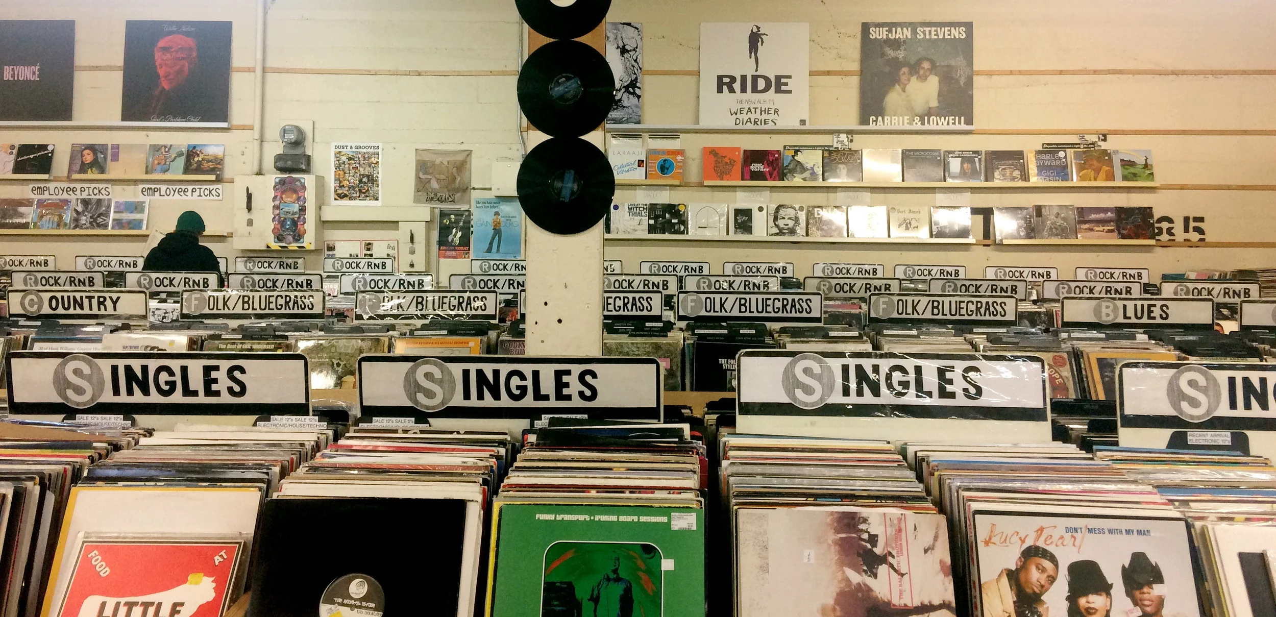
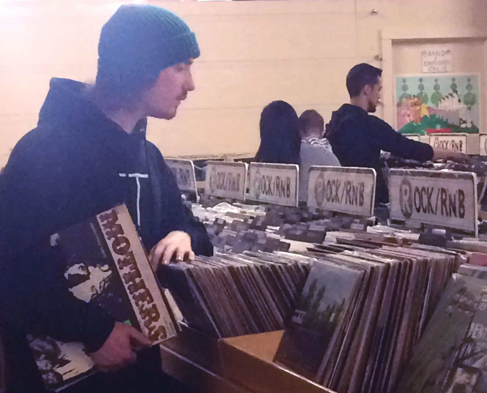
I started my research in the store, interviewing clients to define the target audience and understand the business and user needs.
Achieving users experience an " in-store experience" in the website.
Understanding that main users are music lovers and consume a specific vintage format I realized that the website need to have some native store navigation to make their experience unique. On the other hand, other business with the same target audience usually don't have an e-commerce, and specialized e-commerce are not focused on the same target user, so this became a great opportunity to explore.
Persona
We were provided with a persona; Laura, who was a perfect fit as a client of Everyday Music. She is a digital native that loves vintage and unique things and she is disposed to buy them even if they are expensive.
Steps: Research &Design
Research, Environment observation and Interviews.
Design INFORMATION ARCHITECTURE.
Design sketches, wireframes and PROTOTYPE.
User testing and Iterations.
Design process
Based on the research I set the scenarios and tasks, focused on browsing music and providing an efficient checkout process. Based on the target persona, the website needs to provide a unique online shopping experience.
As a starting point, the current website lacks consistent IA, and as the redesign contemplates e-commerce, it needs to have a clear hierarchically order, so stack of albums can live under a logical category.
Listening users
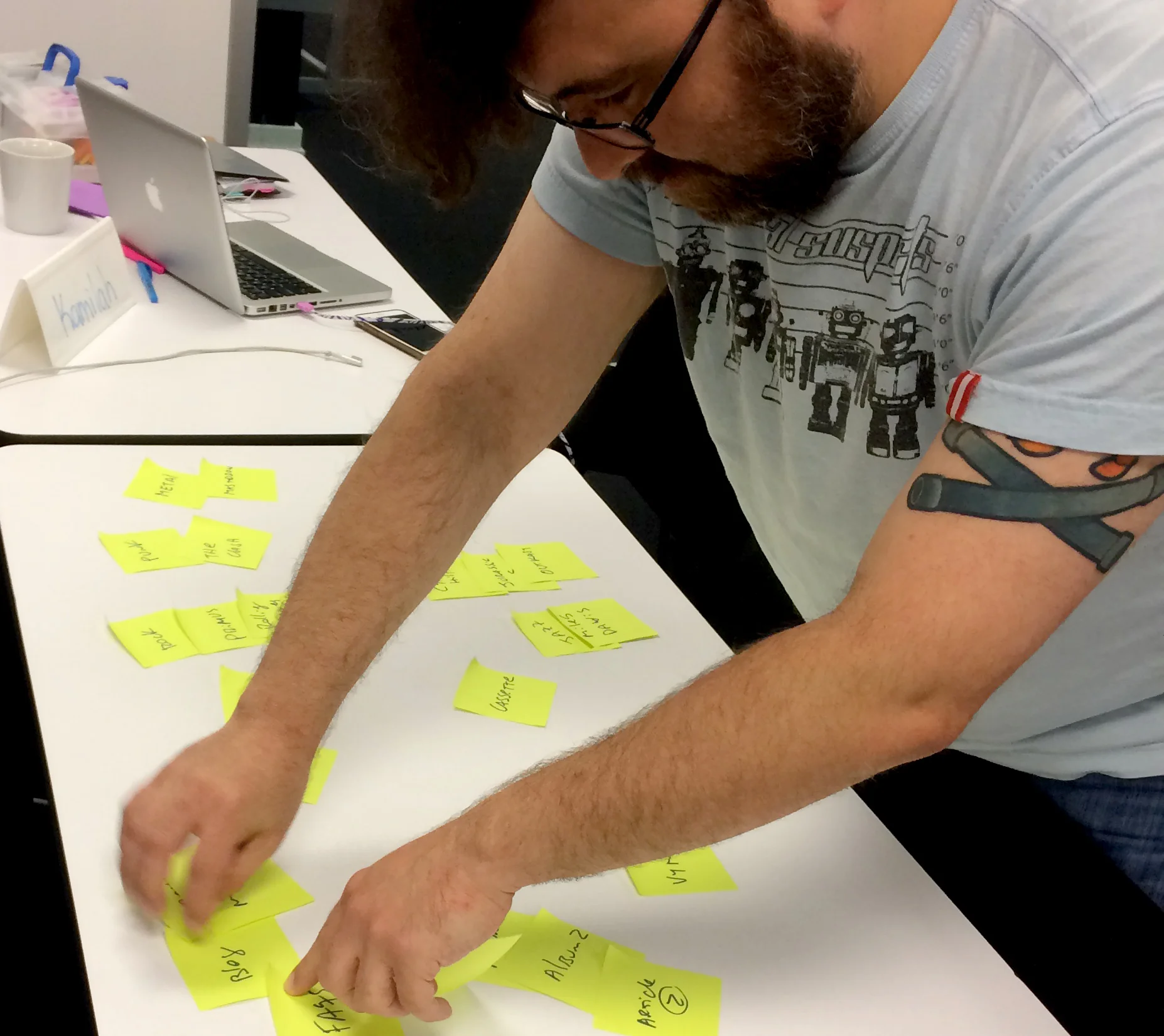
I start designing the Sitemap and the user flow, using tools as card-sorting to organize the information hierarchically.
New Sitemap
- Has 4 levels of depth for browsing albums; Format/Genre/Artist/Album stacks.
- Order categories as News are order by the same logic; News/ categories/article stack
With all the information arranged, I define the user flow, to understand clearly how to navigate the website.
The user flow has 3 main phases:
- Browsing, since the main user want to discover new music.
- Album detail, where the user can see big pictures of the cover, rates or listen to a demo playlist.
- Purchase: Checkout process.
USER FLOW -MAIN PHASES
New user flow - LAURA'S golden path
With all this information I began sketching the home screen, that was the most complex screen. I decided to keep my interaction horizontal to have a consistent direction through all the website, and use carrousel on body content as the main structure to browse albums. To make the website learnable.
To help users navigate content, genres are organized in alphabetical order, filtering by artist name, and primary navigation reflect that of the physical store, so that users can discover music in a real life way.
Final HOMESCREEN
Homescreen
Frame 1: Nav bar with formats categories with a new header that includes an image and an appealing description of the website
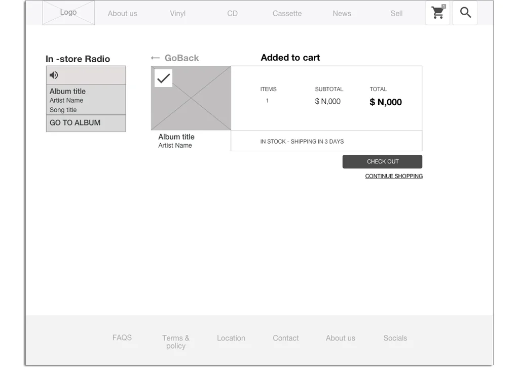
Frame 2: Radio and chat with descriptive sub headers. Add a play button. Also when radio is on you could move the mouse cursor over the radio to see the volume. The radio have a go to album button so if you listen a song you like you can go directly to the album detail page.
Frame 3: Body with 3 carrousels, that animates horizontally with categories set by the business goals, to steer clients to specific products.
Gallery
I decided to incorporate a sub navbar that slides down, for filtering genres and keep the carrousel components in the body. And define a color changes to make more navigation clearer.
When user select a genre user alphabetic filtering + see more feature for each letter Albums in alphabetical order filtering by artist name to keep the navigation form of the store, to force in a positive way the discovering music process, and remembering users in store native navigation.
fORMAT SCREEN
GENRE screen
aLBUM DETAIL screen.
PICTURES OF ALBUM GRAPHICS and record.
The album detail screen enables user to check the album graphics through big pictures and see rates from the store to now the conditions of the vinyl. And see all the basic information of the album as playlist.
Checkout flow
One of the biggest challenge of this design was the checkout process, because for target users this a main pain point, they think it is a slow and tedious process. So everything should be easy, clear and it has to feel short.
Shopping cart
checK OUT FORM
For the first iteration the design of the checkout process, has a review of your cart, the interaction sidebar and a form.The form has two sections for information: personal information and payment methods.
For the final iteration this changed to a simpler screen, divided in three clear sections and has focus call to action button. The radio is still there but automatically goes smaller and the cart info disappears, so user can focus on the form. And the form is divided in three sections; contact, Billing and payment information, to offer a users more clarity. As the information needed is in one screen, users know quickly how many information they need t provide, and they are able to purchase as a guest.
Conclusion
Results
I made qualitative user testing with 7 people. Focusing on the navigation, interest in in store radio, and if they were able to browse easily through the website.
I found that the 3 frames approach was easy to understand and users enjoy the live in store radio and the possibility to interact on real time. Users also give me feedback about the way they enjoy start filtering through format, and that they were able to have big pictures and rates of their vinyls.
Some users feedback was that they hope there was clearer headers for sections and callouts and also I conclude that the home screen should have a big hero image that communicate better the brand.
Next steps
- Create a new prototype focus on Navigation and In-store Radio
- Set a group of testers with the main target profile
- Conduct quantitative & qualitative user testing.
- Measure & analysis
- Iterate
- Look for tech solution for radio design / iframes and ajax.
Most important things I learned
- When the user research includes environmental observation, you are able to notice and see users behaviour that is difficult to reach with web research on online surveys.
- How technical feasibility goes hand-in-hand with your design.
- Understanding content strategy, IA and user flow are fundamentals to a product design.
- Asking for feedback at early stages, made my iteration process fluid and continuous, which helped me save a lot of time and focus on the user.
- It’s crucial to recruit testers that match the design target audience.
"I'm surprised how complex is to solve and understand a purchase form, understanding how critical this form is for conversion"


