BETTER QUESTIONS, BETTER ANSWERS
AVVO.COM / Q&A
OVERVIEW
Avvo is a marketplace for lawyers online, that helps people find and connect with the right lawyer through industry-leading content, tools, and services.
Interaction Designer
I developed wireframes, mockups, defined interaction models, user flows, conduct user testing.
Opportunity to explore
How guidance and Imitation, will help the user improve the quality of questions and, in turn, will allow all users to maximize Avvo’s resources
Problem statement
Avvo has observed that their Q&A form isn’t consistently assisting users in writing quality questions. This negatively impacts the user experience for multiple audiences (askers, browsers, and lawyers).
Goal
Help users improve their question to get better answers, by forming their questions in a more readable, informed and valuable way.
Current website
The challenge was helping users improve Q&A so the Final prototype provides:
A simpler interface which enables users to stay focus.
Brings the browsing experience into the "Asking input field", users can access more information.
Help users to understand and phrase the question.
Final prototype
Approach
We had the opportunity to work with clients, and Avvo's UX team provide us personas, journey maps, and resources to introduce us to their problem. Our main persona is the browser because it´s the one that needs to improve the most.
Our team was: Jing Product Manager / Sam Researcher / Ale (me) interaction designer.
Explored the opportunity
What can UX do to help Avvo's users improve the quality of their questions?
Improving the Q&A form is interesting because we needed to provide users the possibility to ask a question in a very open-ended way considering that every case is unique. They need to be clear about:
What they really need to ask? Understanding their problem and law.
How do I write it (content, structure)? Give them examples, not instructions.
How I can make question valuable for others (creating community)?
Team findings
Research, provided by Sam found that:
Users mainly want to browse,
Like feedback and
Explain their unique situation
Other Q&A sites use filters, quality threshold, provide their users with tips and show previously asked questions
"Good quality question Rubric", provided by Jing, defined that where questions need to be:
Readable
Valuable for the community
Focus in one need
Informed on the law topic.
Steps: Design
Research for Ux/UI patterns of forms
Design the user flow.
Design Lo sketches, wireframes, and prototype.
qualitative usability testing AND final prototype in Invision
Avvo's team request was: focus on the browsing user and work on the form and pages of the ask question process.
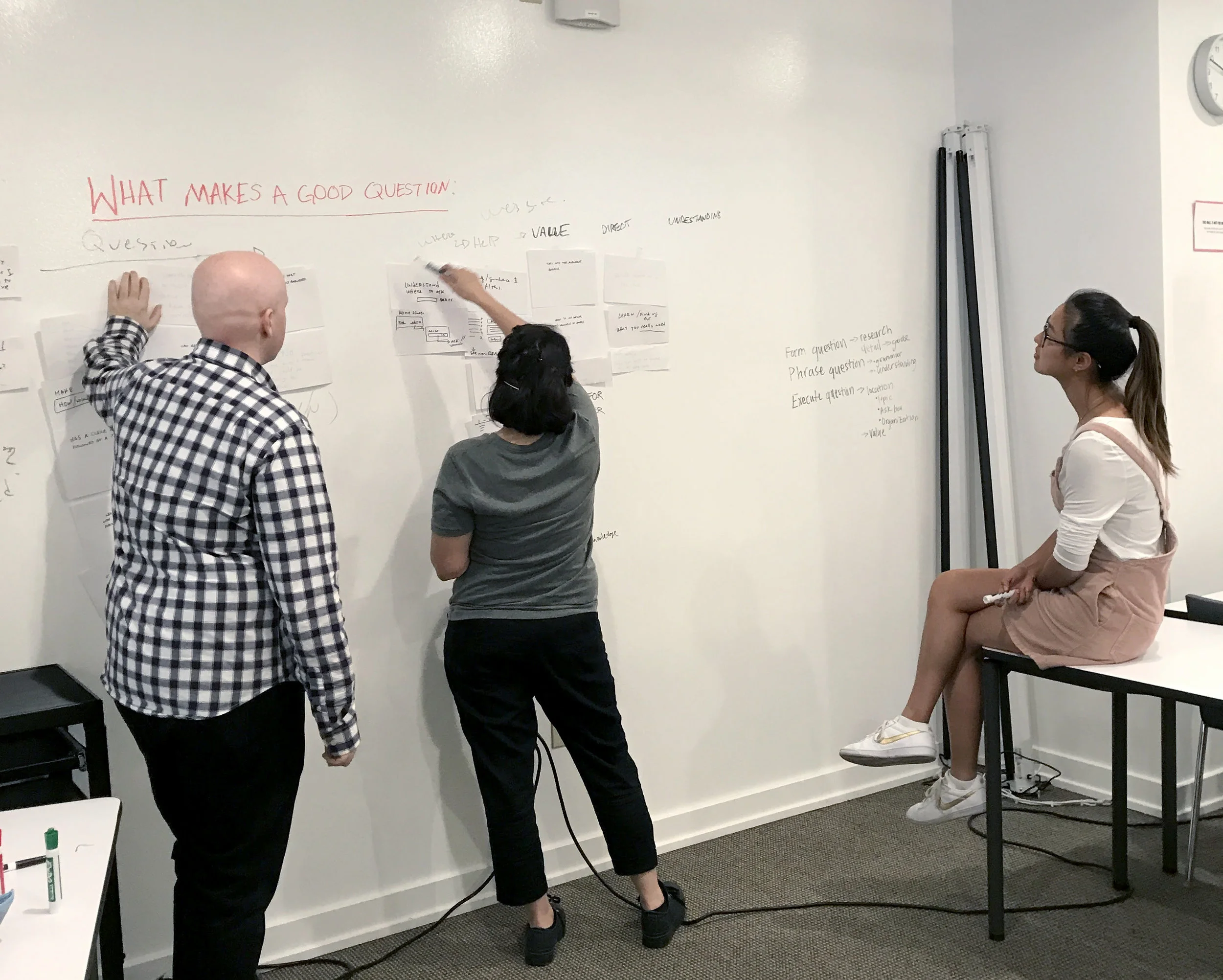
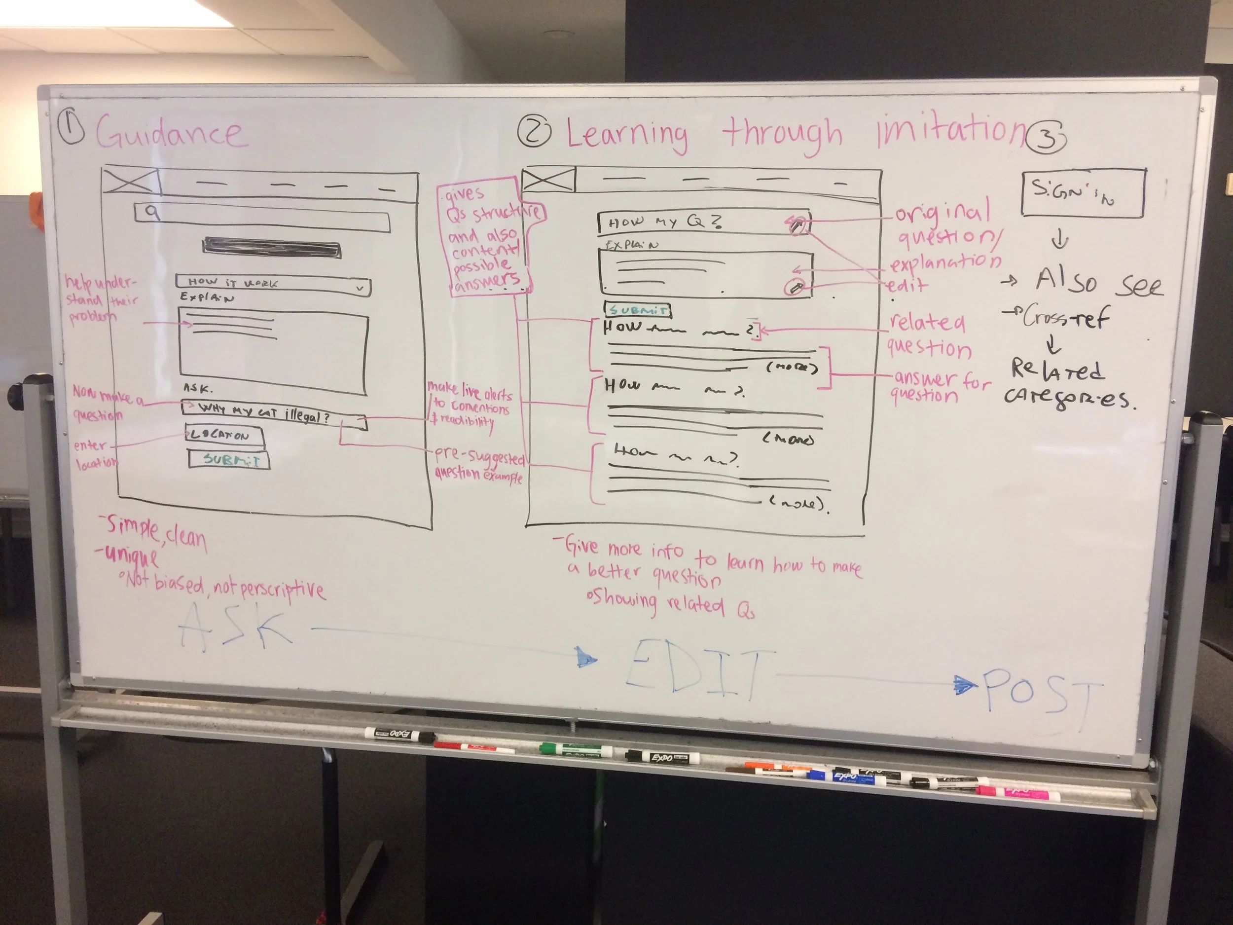
Our stakeholders requested a battery of ideas. For this, I define 2 umbrella concepts that enable us to design and test multiple solutions. While I provide white-boarding and sketching a design a conceptual approach for the solution.
1. Guidance helps users know what to do and how to do it. For example, putting a don't cross sign on a corner and people won't cross. We explore Input controls, validation alerts and structure of the form,
2. Based on several articles related to learning, when people imitate behavior they don't even notice they are learning. This is like having a lot of people cross at a corner and people will follow. We explore: Examples and show related Q&A that match the Rubric standards.
Design process
I researched different UX and UI patterns on how to solve Q&A´S where I found different solutions and strategies for input controls and navigation. Some of the keys to help users submit a question are:
When choosing which question type to use, try to optimize for as few clicks as possible.
People trust beautifully designed forms/websites more than forms that don’t look as impressive.
Display strong social proof in close proximity to your form.
Don’t use placeholder text as input field label, because placeholder would disappear.
When asking a question that users may not understand, provide clear explanations to guide them to the correct answer
Then I drew our working strategy for deliverables and defined a new user flow with 6 main stages, where we get to work in the first 5.
I switched to explain first and then asking because
Some users write their question as tittles because the ask input field was on the top.
It helps browser users understand their needs before asking the question.
Like when people go to therapy they talk about their situation to understand their problems, find their need, and phrase their problems. This becomes a more intuitive way as could test in the user testing phase. With all this information I started sketching.
White-boarding
sketching first screen.
I start asking for feedback and iterate in early stages.
I developed wireframes for the first two pages of asking question process. I decide to keep Avvo's interface because it met several standards that were supported by research, and work with the flow and the input boxes.
1rst home screen design
Asking page
Kept the form in one vertical column.
Switch the flow to explain first and ask later.
Open fields guided users to explain their unique cases.
Add live alerts show whenever users write a question without the who, what, where?
Show an example in the placeholder, written as a question to give unconsciously influenced the users.
Review page
We found in user testing that users in the current design would only check their grammar and spelling, but as they don't have more information to understand what a question is, they won't be able to improve the quality or change the structure of the question.
I add a section of related question for them to have more information to imitate.
When conducting an A/B user testing with 8 people, I ask them to choose one of the paper prototype based on the first page and then submit their question, and complete a survey.
FINDING
Users want to browse and see an example to follow
People that don't know what to ask to prefer to explain first. But people that knew, won’t be annoyed if the question is below the explain
They like open fields to describe their situation
They dislike live alerts, they don't want to be told they’re wrong
When asking a question was first, some users write titles anda write question in the explanation.
User quote: “ I would probably default to using a related question.”
After a second design studio with stakeholders, we define 3 main categories to explore:
Prescriptive search
Showing examples
Chatbox
Each of us developed one idea, where I iterated the 1st prototype exploring the prescriptive search.
Final HOME SCREEN
ITERATION - PROTOTYPE 2
I add example questions on how it works, keep the inverse flow and add a prescriptive search input for "ask your question", where related question appear based on users keywords as a dropdown.
Those questions are sourced from other users and will contain the answer. A "see more" allow the user to view the answer and rate if it was helpful, so Avvo could measure what gets ranked as quality questions.
We set a scenario to design and test. I conduct 8 new user testing, where I ask them to do a task on Invision prototype and a post-survey.
Scenario: Tom has been making amazing ice cream for family gatherings for years. His brother-in-law has encouraged him to turn his hobby into a small business and wants to be his partner. Tom has never been in business before and feels over his head. He finds Avvo Q&A after searching different topics on Google. He wants to ask a lawyer how he can formalize a partnership in a way that protects him.
Findings
People would like to see examples and how it works in the beginning
Users perceive the suggested Q&A was helpful and 80% of them think this helps them to improve.
They were concerned about clicking "see more" because users didn't know if this would take them to a new screen and their input would be lost.
Some users left to submit a question because they received the answer they were looking for.
User quote: “I like the predictive search, it's nice to see what other people asked”
Dot voting
For the final prototype
We print every prototype and our stakeholders and team vote on the main ideas they like.
Jing develop a paper prototype with a new interface much more focused, simplified and guided. And everybody gets to like this new interface. And I developed prototype 2 (already explained above), which was voted on the prescriptive search box, the inverse flow, and the more descriptive how it works & examples.
Designing the Final hi-fi prototype
Start page
select location
explain your situation
ask your question
We decide to keep the new simplified and focused interface and kept the solutions developed in prototype 2.
I designed the start page showing all the information on the screen so users won't have to click the dropdown information, comprehension is improved with iconography. We add a prescriptive dropdown so users could choose quickly their location, and provide an explanation of why Avvo need that information.
I choose a text area, so users have the opportunity to explain themselves and add a dropdown to see examples. structure the label like a question. For the prescriptive search, we decided to change the "see more" link into a dropdown icon, so users would know they won't go to another page. Also, structure the label like a question.
Conclusion
Results
We provide a battery of new ideas to Avvo team, and a frame for an approach to future design and testing in addition to suggested possible KPI's test performance in the product. Avvo found the presentation helpful and they set a second meeting with their UX team and product managers where we presented our solutions.
User testing found that 100% of users prefer the prescriptive search for the Q&A, and 80% felt the new form would help improve their questions.
Next steps
A/B test the new flow
Measure the click rates when users open the related Q&A.
Conduct qualitative and quantitative user testing to see how current users react to the new design.
Most important things I learned
Keep on asking feedback in the early stages.
Users want to browse. They are used to search Google, so listen to their needs.
Forms are a critical conversion point, users react to them in different ways to keep them as simple as possible.
Use the right tools to help the team and stakeholders listen and select ideas easily.
Make research that helps you improve your role. That is fundamental to keep on learning.
"I'm surprised how details can impact a whole flow, for example, if you change the position of an input field."


